
Before & After: Living and Dining Room
Gets Some Modern Chalet Vibes
We’ve got one main open concept living/dining room that needed to wear many hats! Not only is this the only option for a TV room in the house, it was also a massive space meaning we had to be smart about space planning.

The previous owners were inspired by Frank Lloyd Wright and that feels obvious when you look at the living room ceiling detail. The way the ceiling is built with low soffits surrounding the entry and perimeter of the room is a classic FLW technique used to create dramatic transitions from entry spaces and hallways into larger living spaces. He used this as a guide to pull people from spaces with low ceilings to high. He was also known for low and long dramatic overhangs. Now our house is not a FLW home, but you can see the influence through some of the design choices made by the original owners.
We didn’t want to disrupt the original intent of this room but rather bring it up to date and put our stamp on it while retaining the original style. If you want to see the space come together check out Episode 3 of The Home Reno Series!
If you are looking for a full list of products used in the living and dining room, check out our blog post:
Before and After
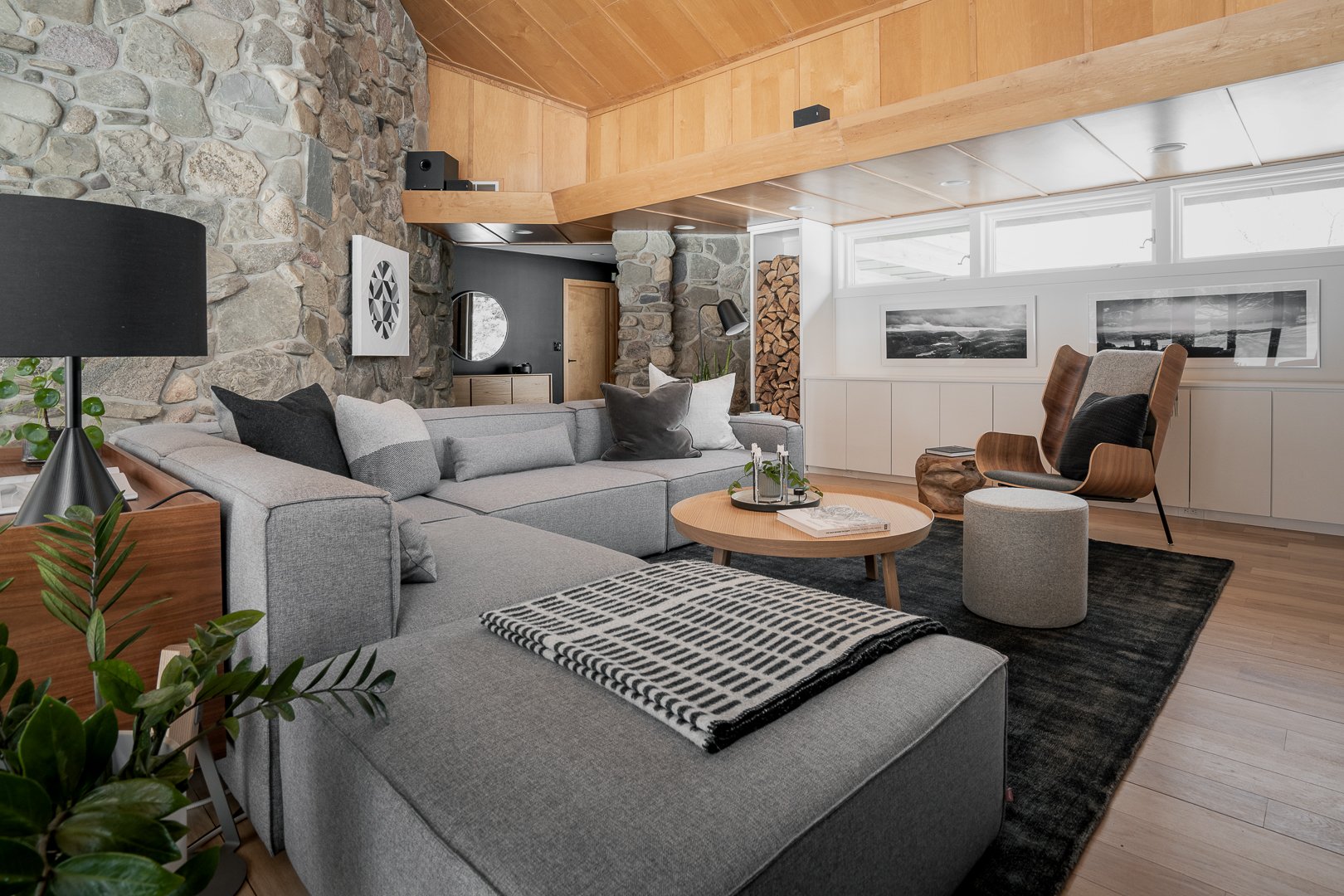
We loved the way the space made us feel but we were overwhelmed by the amount of wood and stone in the house. The living room side of this open concept space felt really dark with the heavy wood cabinetry. We found ourselves gravitating to the opposite window lined side of the room, neglecting the living space all together! We made the decision to minimize the wood by painting that side of the room white, which essentially acts as a giant reflector bouncing light into the shadowed side of the space.
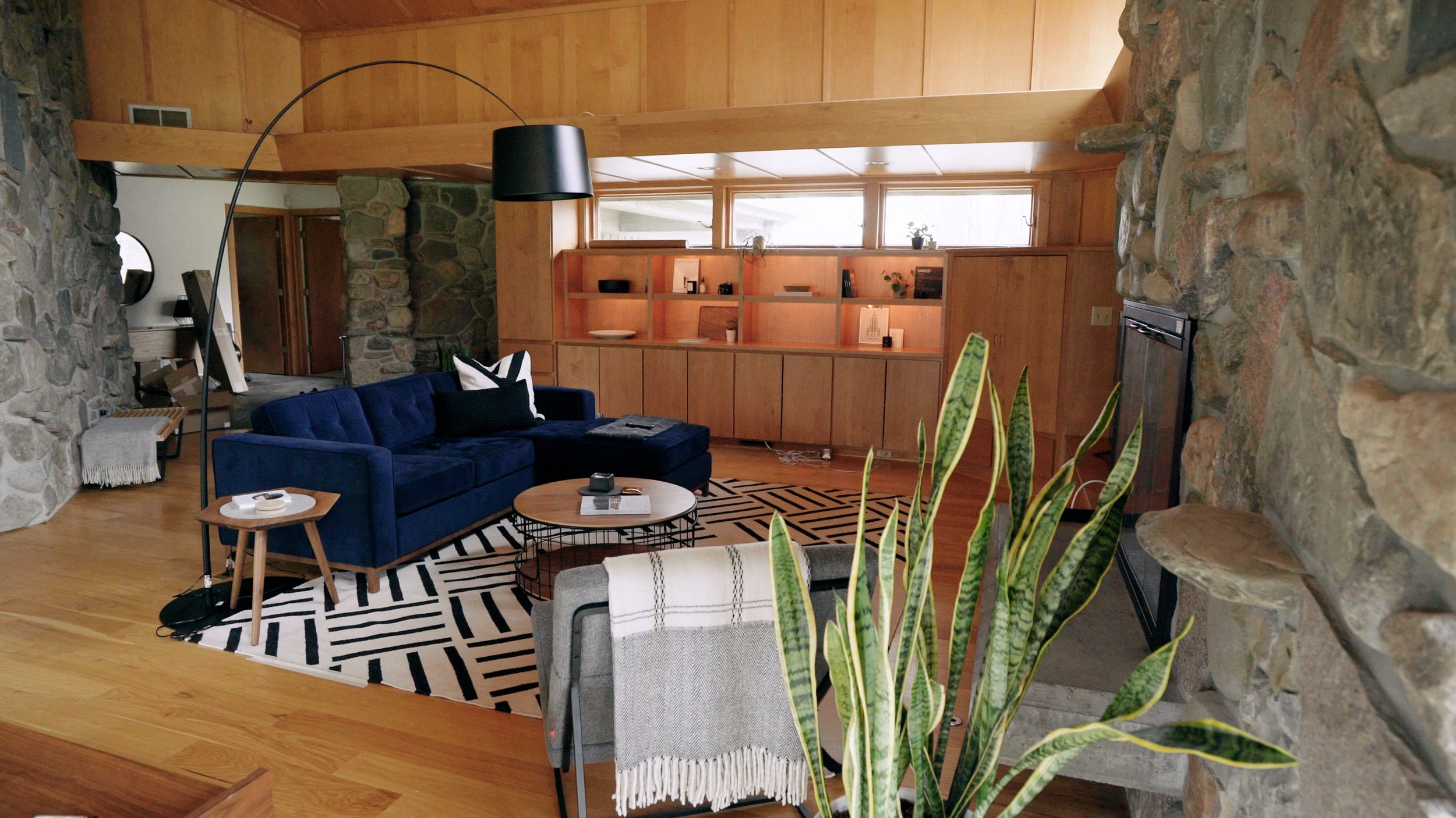

We want to say a massive thanks to Gus Modern making our couch dreams come true and providing us with the Mix Modular sofa in Parliament Stone. It’s the perfect size and style for this space and SO GOOD for lounging!
After a debate on wether we should paint all the wood white, we decided to keep the ceilings and windows as is. We had the floor refinished in a water-based matte clear coat which lightened the finish and toned down some of the orange.


We loved the custom cabinets that came with the house, however the corner unit was built for an old CRT TV and screamed “I WAS BUILT IN THE 90’s!” So we removed it and salvaged as much of the cabinetry as we could. The doors went to our scrap wood pile which we’ve been using for projects around the house, and we mimicked the build of the original cabinets to fill in the gaps we removed.
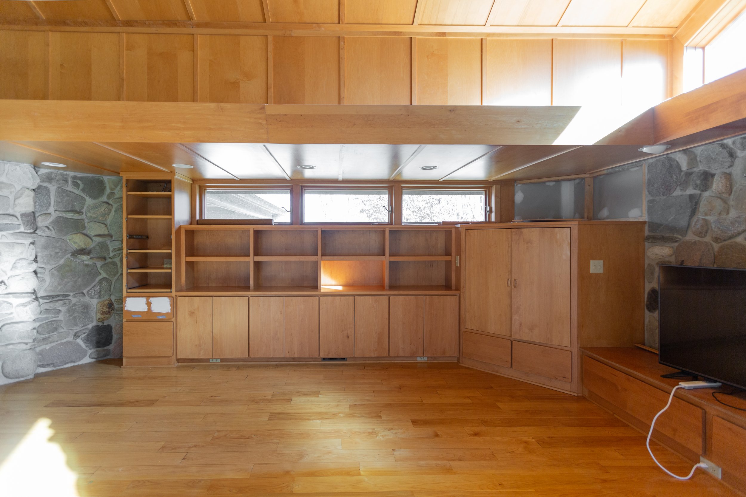

We removed the guts from the tall vertical media cabinet and converted it into wood storage. Not only is it functional but it also adds a different design detail to the space! We also painted out the entry beyond the couch in matte black to contrast the now bright living room.


The media wall was a little tricky to work around since we had existing lighting cut into the wood soffit above, so we decided to center our TV on the lights instead of on the wall or over the cabinets. The TV is mounted on an arm that pulls out so you can angle it to your preference for wherever you are in the room. More on this plus other stories on the Aftershow Edition of our podcast Tuxedo Time.

The original room had a ton of can lights which we’re really great when you need a bright room, but we needed some accent lights for cozy evenings. We added lamps in strategic places, installed a Nelson Bubble Lamp above the dining table for a nice soft glow, and outfitted the entire space with Phillip’s Hue light bulbs.

Color & texture
We had a lot of stone and a lot of wood happening in this space, we wanted to tone down the orange so we went with neutral grey tones on the furniture. When it came to adding wood tables and accessories we kept those tones in the same family as the existing wood. While there is a variety of wood in this space, all of the wood has a warm undertone so they work together while creating a cozy, collected vibe.
Details
The Dining Room
We were working with a 20’ by 30’ room that had to have many functions. Not only did the room have to house a media/family room, but it also had to have a dining space. We used furniture and rugs to break up the open space, and added a large table that can be expanded to seat 12 under a newly installed Nelson Bubble light (thank you Chris).

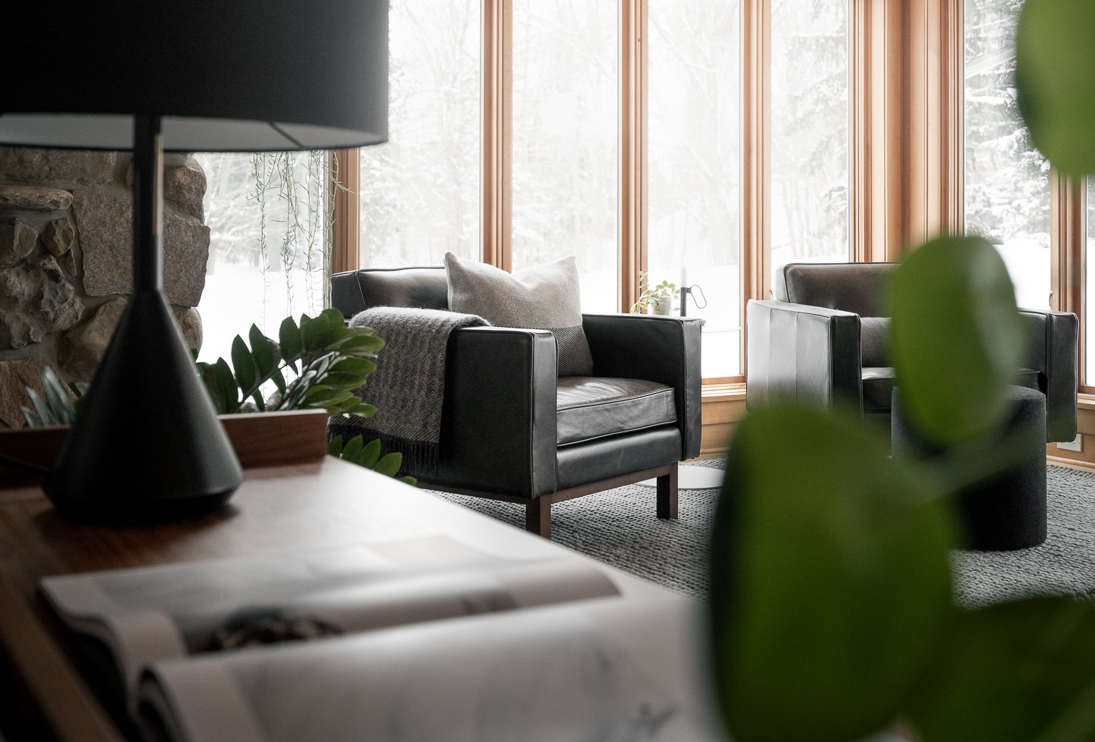
Beyond the dining table we had room for a sitting area. Since we found ourselves drawn to the big floor to ceiling windows when we first moved in, we knew we had to make a spot for us to get cozy over there and sip hot beverages while enjoying the views.
The Seating Area
Another shout out to Gus Modern here for hooking us up with the two Embassy Chairs in Black. We really like a fabric couch for daily use but love the material change on the chairs. The leather is SOOO soft and also makes a great backdrop for photos!
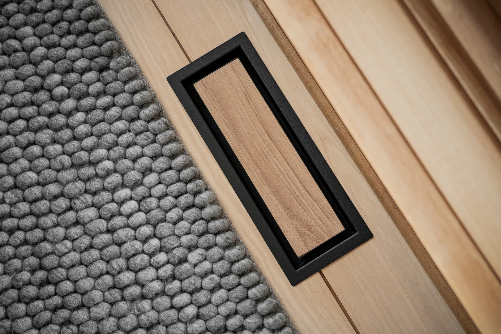
We replaced all of our old brown metal vents with Aria Vent and OH MAN what a find, who knew vents could look so good!
We shopped our house and reused our Gus Modern Mimico Cabinet from our Vancouver Apartment up against the back of the couch to act as a room divider. It gives us some extra storage, mostly for my excessive candle collection LOL.

The Living Room
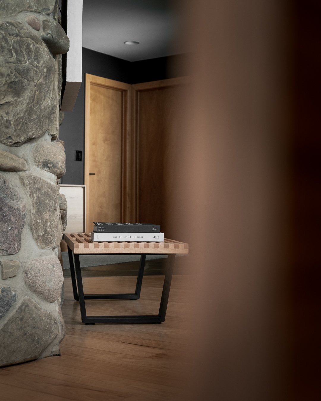
I think this here might be my favourite view. We commissioned this art piece from our friend Jessica Waterman who makes colorful Wooden Quilts and other artwork using Newfoundland milled wood. I was so happy when she was open do doing one of her iconic works in my favourite grey tones! I love having a little piece of Newfoundland to look at every day and it’s the perfect pair to our DIY Knock Off Nelson Bench.

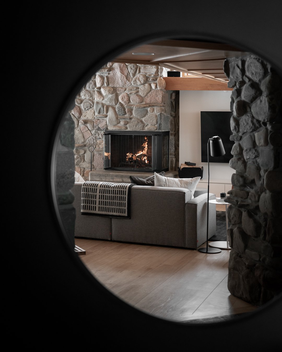
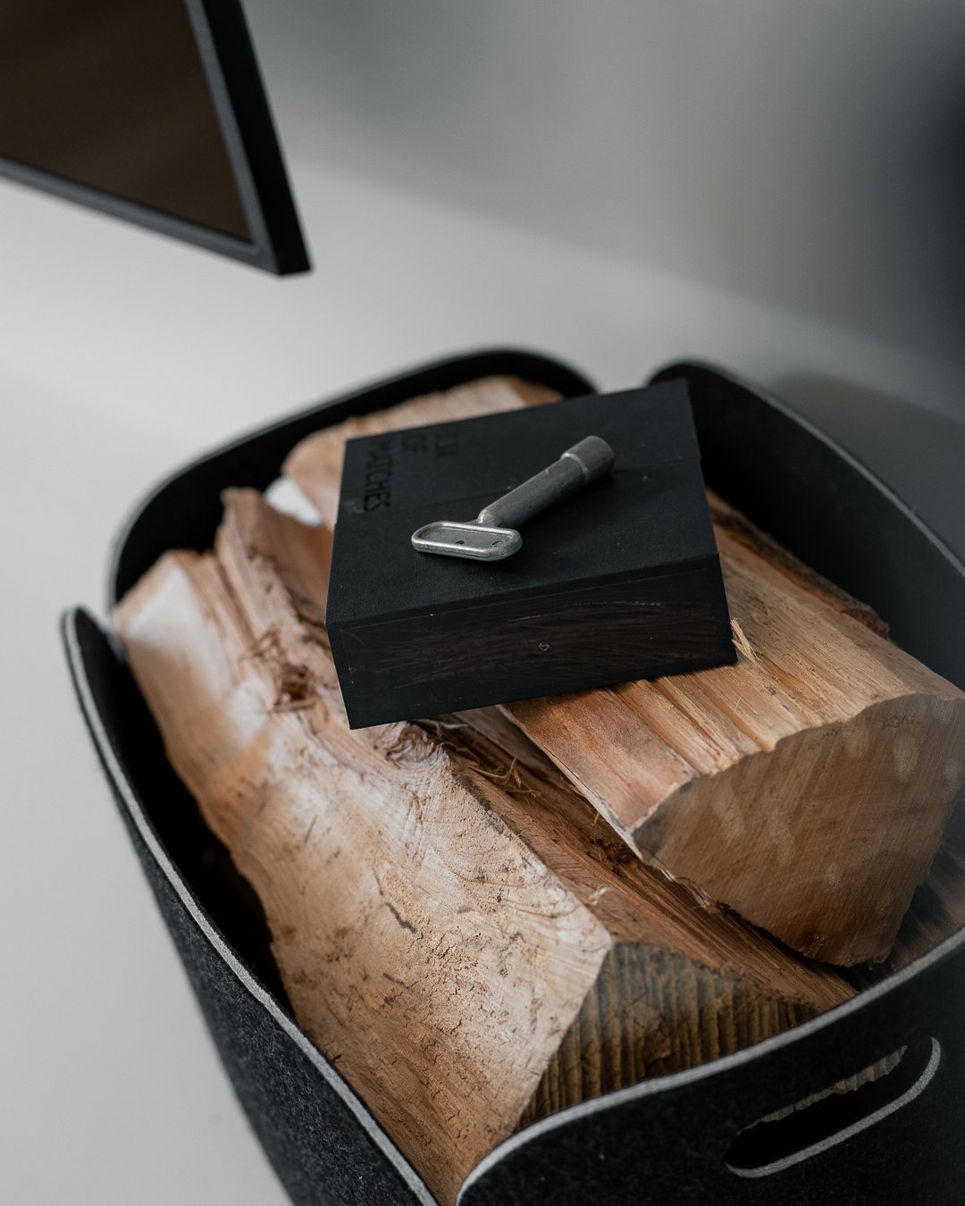
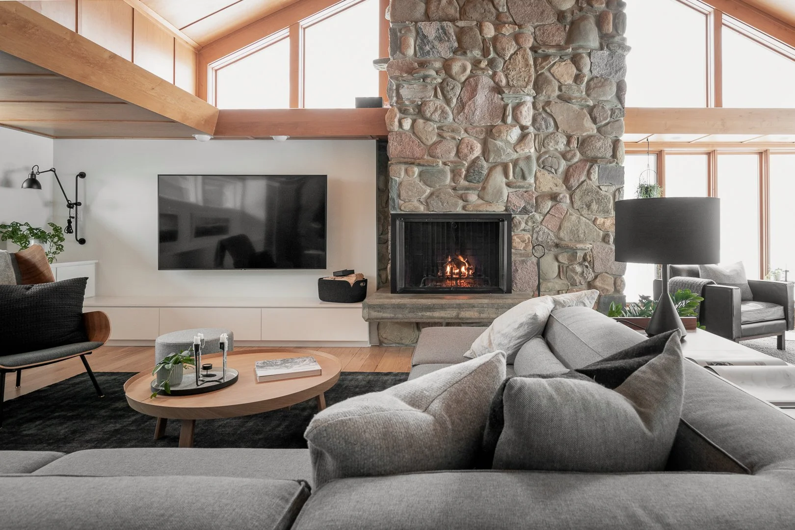
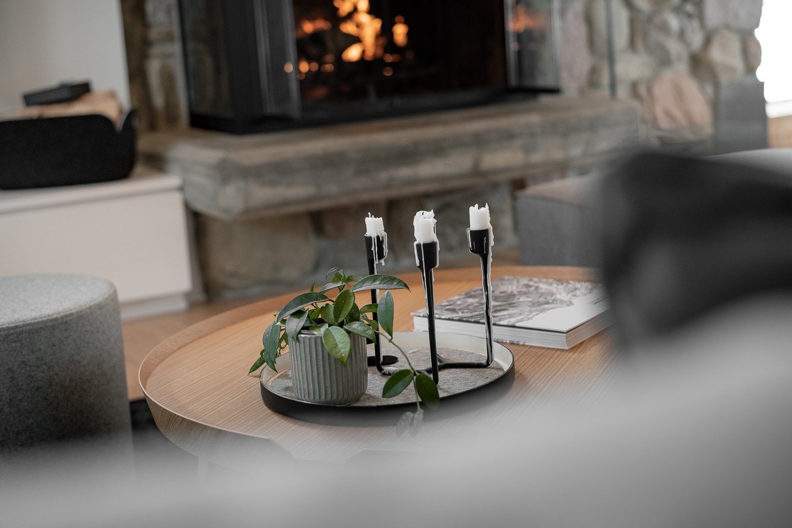
Remember above when we talked about minimizing the stone? We built out a drywall media wall over some of the stone next to the fireplace. A controversial decision but it’s the perfect spot for our 75” TV and makes the fireplace really stand out. We have a Restore Basket by Muuto sitting on top of the white Corian counters which holds a batch of wood for the fire. On top of the pile sits the first piece in our home accessory line the Coffee Table Matchbox.
Playing with contrast
We wanted to keep the living space as bright as possible but found the cream entryway made the spaces blend, so we painted it out black which adds a nice contrast between the two rooms. The black walls also tie in with the black and charcoal accents in the living space which gives a nice cohesive feel!
Wall color: Decorators White by Benjamin Moore, Black (2132-10) by Benjamin Moore
If you want more Home Reno Series content check out the full playlist here! We’re also deep diving on all of the behind the scenes from each episode over on the Aftershow Edition of our podcast Tuxedo Time!
Becki and Chris
Instagram: https://www.instagram.com/beckiandchris
YouTube: https://www.youtube.com/c/beckiandchris
Twitter: https://twitter.com/beckiandchris